
Friday, December 16, 2011
Tuesday, December 6, 2011
Singapore should have more buildings with funky architect like gardens by the bay!! I love the design of the building and the tree/fan/whatever you call it structures, it's red and if I'm not wrong people can go up there. I especially like the 2 buildings with the white skeleton like thing over them. The glass building is slanted to one side then the white skeleton like structure slants the other way it's so cool!!! Sg should have more buildings like this!! Interesting architectures!!!
Sunday, December 4, 2011
random post
okay so i've checked, my comp's totally down. crashed
argh i rather blog using my comp, no sense of security using a laptop -__-
okay anyway, decided to upload phone photos, camera photo's (if have any) will be uploaded only after my comp's fixed :((
this was taken in uk
sigh love the architecture.
i've always wondered why singapore cant have such buildings, like maybe the fullerton? or the supreme court building? but slightly more fancy!!! nowadays all we see are glass and metal skyscrapers!! okay thats cool also if its like the gherkin or the shard or something by Renzo Piano (he designed the Central Saint Giles too! the colourful exterior building we saw during the green tour in uk gcp!! but sadly it's not really selling well but if its in SG i bet it'll sell well)

and i took this using my phone from my cam (okay that sounds stupid but i like the pic so wanted a copy on my phone)
that also explains why its a little blur but i like it like this :)
i like the colours in this photo
i like taking pics in the uk, the sky is always so blue~ maybe sg's sky's like that also just that i dont really realise :/ but i do know the morning sky's v nice (i live in the east, nice sunrise every morn ^^)
oh btw, this place is haunted. haha by 3 female ghosts and im telling the truth

and this is a church. nice sky right?!?! it looks nice and warm but it was DAMN COLD that day. the wind was blowing and i was freezing -___- my hot pasta turned cold super fast

and this is an operating table (part of the table lol) cool right? haha

remember this?!?! aep london paris trip!!!
the bridge!!! millenium bridge? if i remember correctly, the one outside tate... zz i not sure tate modern or tate britain, i think its tate britain, the building with the long pipe like thing sticking out
sigh i miss the trip, it was so fun
nice memories ;')


this is random but i tried doing leopard prints on my nails using different colour! when my nails were long after i came back from the uk cause i didnt bring a nail clipper there. couldnt stand long nails so i cut it soon after i did this haha long nails= larger surface!!!
gonna try something else next time

haha and here's a tried and failed a little attempt of a person
dont know if you can identify him :/ haha if you cant means i've failed (awww man!)
the left side's abit screwed not very sure why myself. trying to figure out haha
oh and its unfinished!!! will finish it and upload a finished version :/

edited a little after i took the first pic~ can you spot the difference? its kinda subtle though
(ans below this pic)
(ans below this pic)

its not v obvious okay maybe its obvious to me only hahaha. well the left side, the first pic is straighter and larger, so i erased it and his forhead at the left side is a little more curved. tried to make the shadow parts smaller though :/
so unsatisfied with the left i covered it. hahahah so this is the right only, i think its a little more obvious who he is like this

the blending's not that perfect im trying to improve
i dont know how he did those invisible blending @^%$&@$& jealous -____- and full of admiration
sigh such nice drawings! just continue doing art (inserts angry face) but i doubt he will quit doing art as in even if he's not taking art he'll continue doing art in his spare time and thats good :)
oh anyway, this practice sketch, THE HAIR. OMGGGG SO TIRING but fun cause i didnt really follow the picture, it was too hard (surrenders) so i randomly did the hair. why must he have so much highlights?! why????!?!?!! i tried, i really tried following the pic but its impossible! (for me) so i just drew my own version of the hair LOL hope its okay
next time i'm gonna try another person hehe excited excited!!!
okay thats all! now i have to start on the present!!
her bday's coming soon!
excited again hehe
photos: using iphone, unedited
drawings: 2,4,6,8b pencils and a4 paper <am not really good with controlling my pressure thats why i use so many pencils :( >
Thursday, December 1, 2011
argggggggggggggggh.
it takes forever for me to complete one drawing
lost my motivation
gotta find it again. i'm done w the face (but it looks kinda funny :/ need to practice shading more, realised im not that good in it)
all that's left is the hair and the blurry parts.
I HATE THE HAIR. WHY MUST HE HAVE HIGHLIGHTS?!?!?!??!
okay jiayou. will complete it before i leave for thailand (yeah i know flood flood, hopefully it'll be better by the time i go)
on a side note, i gotta start doing watercolour, its been such a long hiatus from art :/
and when my comp's all good (it crashed and died, this's a laptop) i will upload uk photos and theres some that i really like so i guess i'll post them here? not gonna edit any photo cause i dont like editing, prefer natural stuff i guess? partly cause im lazy too :/ haha ohwells, will update this space soon.
i guess its turning to a more personal blog? aside from the art stuff, too troublesome to create a personal blog cause i'll forget about it soon enough (which happened mannnnyyyyy times)
Tuesday, November 15, 2011

Monday, November 14, 2011
print print print
print making again
this time with colours haha
first layer colour: blue
second layer: red
third layer: purple
fourth layer: black
second layer: red
third layer: purple
fourth layer: black

the first layer paint. had to mix it cause there wasnt any light blue. the ink is not normal paint. its meant for wood printing? didnt see the bottle carefully but its sticky, v sticky (which partly explains why the ink transfer isnt that well. well, i dont really know how to make a full smooth print. perhaps making the paint less sticky? add some chemical? never tried so i dont know. there were limited materials but i guess making using a less sticky kind of paint works? gotta try it next time hehe)
(white is the paper colour haha)
so first you draw whatever pic you want on a foam board. then you use carving tools (like the wood carving thing we did) to carve certain parts you want. the part that you carved out will be the paper colour, meaning it wont have that colour when you roll the ink over. it requires a little planning but not much is needed. you can just roughly print and work as your design goes.
i forgot to take pic of the first layer :/ so here's the second layer and the final layer. too engrossed to remember taking pic of the 3rd layer

as you can see at the bottom, this is print 3/3
meaning its the third print and in total there are 3 prints.
since in print making, there wont be exact same results unless you are using a machine to print. so all 3 print will vary, which i find it interesting
meaning its the third print and in total there are 3 prints.
since in print making, there wont be exact same results unless you are using a machine to print. so all 3 print will vary, which i find it interesting

this is the first print, as you can see, the ink transfer is quite bad (red ink)

so i used more ink on the 2nd try and it turned out quite nice haha
for the 3rd print i tried lessening the amt of paint but using a little more than the first one
for the 3rd print i tried lessening the amt of paint but using a little more than the first one

foam shavings.
MY FINGER SERIOUSLY ACHED. PAINFUL!! T-T
but it was worthwhile
so the 3 pieces below are the final. but of course they are different. so each piece is unique :D
i like how each of them turned out.
if possible i would try different colour combinations haha
but it was fun :D


Saturday, November 5, 2011
chi cram class
some random doodles during the multiple sessions of chi cram classes. oh gosh i need to start doing the papers already :(


Wednesday, October 19, 2011
post no 2
post no. 2 after eoys haha
this post is about birthday presents
last last year, sec 2, lynn really liked the colour green. its like her fav colour, so i bought something green for her birthday. i bought her a cactus. HAHA quite innovative right? LOL
so last year, i went msia and bought ostrich's eggs and gave her as her birthday present

Tuesday, October 18, 2011
ITS OVERRRRRRRR
HOORAY EXAMS ARE OVER!!!!!
all that's left is chi o lvl!!!
here's my first new post after EOYs!
Thursday, September 29, 2011
Monday, September 26, 2011
coursework.
argh. i didnt want to post my coursework till everything is done
pictures below show the progress of my work.
(picture and word post)
COURSEWORK 2011
COURSEWORK 2011

bt2
i saw eli had included her essay as part of her essays. LOL sounds funny. so i'm gonna include mine too, for convenience sake as well haha
 \
\
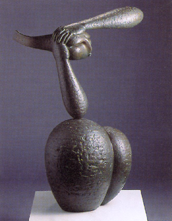
Looking Ahead by Ng Eng Teng, 1987
Bronze,79 x 56 x 29 cm
Bronze,79 x 56 x 29 cm
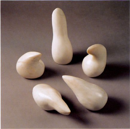
Growth by Han Sai Por, 1985
Marble, 111.2 x 88.5 x 40 cm
Marble, 111.2 x 88.5 x 40 cm
a)Describe the subject matter of both works.
Sunday, September 25, 2011
lets get healthy
Saturday, September 24, 2011
this is what i call narrating using dance.
Friday, September 23, 2011
viva
viva voce's over!!!!!!
hah!
had mine today, was kinda fun explaining the process, inspirations and my artwork. im satisfied with my work so far, although if given more time, i would add some stuff as mentioned to the mrs tans.
i think viva voce is interesting and fun. it allows me to convey my ideas and reasons behind my work. i think i enjoy doing such presentations? at first prior to the presentation i was a little nervous and i had remedial before it so i didnt have much time to think of what i wanted to say. i guessed i just go with the flow? i explained whatever popped into my mind. i think its important you say what's on your mind for viva voce, what you want to express, and why isit done that way. why not other ways? everyone should make good use of this platform to tell the mrs tans what your work is about. i genuinely enjoyed viva voce, i wouldnt mind a second round but i've said everything i wanted to say already haha. i think i took quite a while for viva voce but im happy that i said everything. the process is kinda fun, i wasn't too formal (not sure whether the teachers mind it) but precisely because i was less formal, it was enjoyable to talk about my work.
to fellow aep-ians/gap-ians(i doubt any gap ppl) who hasnt gone for viva and happen to read this post : ALL THE BEST!!!! its really quite fun so just relax. its nothing difficult and actually you dont really need to prepare. i didnt prepare or plan what i wanted to say. since its your work, you WILL have things to say about it and dont worry about questions cause its your work! you WILL know how to answer the questions. this project is something that we have worked on for months, you WILL know what you are doing and you WILL know how to respond and you WILL know what to say. dont say you dont know, just go there and relax and say everything about your work. i think you would enjoy the process too :}
jon rappleye

Fantastic Planet
acrylic and spray enamel on paper
42.375"x72"
2008

A Litany in Time of Plague
acrylic and spray enamel on paper
22.25"x30"
acrylic and spray enamel on paper
22.25"x30"
2008
Wednesday, September 21, 2011
andy goldsworthy
today we had SOVA lessons as per normal and covered Andy Goldsworthy. He is AMAZING. here are some of his works
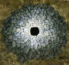 (toner value)
 (forms, shapes, lines)
Monday, September 19, 2011
introducing an artist the same age as us: lee lip jiang!!! haha, he was in my primary school, he is now in SOTA. never talk to him but his talent is crazy!!! he has this series of work (its ongoing) and it is all base on a simple template of his face


every week or so, he would post a new picture of his face and these pictures are based on themes. so far he has 189 pictures. how cool is that?

Saturday, September 10, 2011

Wednesday, September 7, 2011
i love watercolour


its been like almost a year since i used watercolour!!!!!
these are some of the prep drawings that are included in the coursework board. its kinda fast like 10 mins plus per work, excluding drying time. its done on normal a4 size paper, not watercolour paper so the effect is slightly different, like the colours are in patches rather than nicely blended. but i like this kind of texture too. because its not on watercolour paper, the watercolour is quickly absorbed making blending difficult.
i used the lightest colour to paint everything, it acts as a wash, and then i build up the colours. when its all dry, i use pen to outline and fill in details to enhance the works, or else it will look very messy and incomplete. usually people are hesitant to use watercolour because they say they dont know how to blend, not good at it, blah blah blah. i personally think that watercolour will vary from one person to another, just like any other medium. so there's no right or wrong to watercolour, no good or bad. everyone's watercolour painting will come out differently. i personally like watercolour, its one of my favourite mediums. i guess most people are afraid of using watercolour because they are afraid that their work will not come out nice but the most important thing in watercolour is the first step, just like calligraph (calligraphy requires even more courage lol, cause its like irreversible) however, it is reversible for watercolour. :D
i encourage everyone to try out watercolour, its kinda fun and its fast. it covers large areas easily :)
on a side note, some tips on watercolour (im no professional, its just some tips that i think will help base on my own experiences)
1. this will only work on watercolour papers: watercolouring is a reversible process!!!!! just use water and wet the area that you painted wrongly, then use a cloth to rub the paint away (gently rub--> can use cloth of the paintbrush) there may still be stain marks if you're using a dark colour but most of the colour will be gone. <it works only if the accidental paint that you painted/dripped onto the paper is fresh. eg: it wont work that well if painted on for a while and all of a sudden you want to remove that portion of paint. this reversible thing is usually for accidents>
2. for my kind of watercolour painting, use more water. well watercolour is about water and colour right? so if you were to use little watercolour, then i guess it would be slightly difficult to blend? then again, different people have different style!!
3. dont be afraid and just paint. dont worry about the outcome. you can always tweak it a little so that it becomes nicer. its just a come and go thing i guess? art is so veratile, you may never know, what seems ugly to you may seem nice to other people. take this opportunity to try out new things too!!
4. have a palette. i have a watercolour palette and i dont wash it (i will upload a pic of my palette-> its so dirty!!!! hahahahaha) you dont need to wash you watercolour palette everytime you paint. in fact i dont wash it haha, i just close it and keep it and reuse it again. its very convenient :) in fact, its one of the most convenient painting mediums!!!! its like instant noodles!!! just add water!!!!!!
5. try not to use the hard bristle brush when doing oil paint, like those brush that you use for oil? i dont think the effect for watercolour is very good :/ but watercolour brushes for oil, thumbs up. haha, okay it depends on what kind of painting you are doing
prep work:
watercolour and pen
Saturday, September 3, 2011
ECO ART
aurora robson makes art from recycled materials


Robson’s work uses recycled materials to such an extent that she now enjoys receiving junk mail because it gives her new material to create her work. “The language and costly graphic devices and fancy printing used in junk mail gives it a persuasive, positive and personal flavor, making it great fodder for my work. My practice is ultimately about recognizing and embracing new possibilities and encouraging others to do the same,” she writes in her artist’s statement. Some of her more memorable pieces involve plastic bottles carved, cut and twisted into romantic, unrecognizable forms. Like the best artists working with recycled materials, Robson makes the trash she works with a thing of beauty and mystery.
print print print


medium: printing ink, acrylic paint with mixing medium, colour pencils, black marker
on a side note: I NEED A CONCENTRATION PILL ARGH.
Friday, August 19, 2011

Sunday, August 14, 2011
bits and pieces


Subscribe to:
Posts (Atom)