Wednesday, January 26, 2011

colours colour the world

right side is using crepe paper and sticking them into a box. left side is a quick painting of the right side
practising colour mixing!!
everyone should try this if them wanna improve their accuracy for colour mixing

right side crepe paper, left side paint
medium: crepe paper and water colours
info: drawn on a a4 sketch book

snippets of fonts from magazine and me completing them, it was quite fun!
trains you to observe so you can draw them accurately
medium: magazine cut outs, pencil, marker
info: drawn on an a4 sketch book

the left side is made of many many small boxes and just by shading the boxes, i get a pixellated picture of the right.
its done real quick in like 15 mins so its no very accurate
medium: 2b pencil
info: total size of both pics is an a4

sorry about the reflection, cause its acrylic and it sort of reflects light :(
will upload another picture of it when i have time

attention paid to detail! attempting to create a texture for the frog's skin. the eye is smooth and theres reflection in it too! the frog's skin is slightly rough, just like many many little goosebumps (i think you get the idea what i'm trying to paint out)
frog on a strawberry! i cant turn the first picture around, so sorry!
medium: acrylic paint
info: a3 size black paper


pencil drawings of a chinese mushrom. loads of details!!!! good training for observation skills!
medium: 2b pencil
info: all 3 drawn on an a4 sketch book

this is the painting of the mushrooms. drew lines across to 'cut' the painting up and painted them. its contrasting as each strip alternates between cool and warm colour. right most strip(supposed to be the bottom of the painting, cant rotate it) is cool, followed by warm. also, for each section of the mushroom, cool tint and cool shade. so there are contrasting parts everywhere. it is messy in a sense but it creates an interesting composition

top 4 pics are done in 2009, rest are done in 2010

Monday, January 24, 2011

have a happy bunny year!

medium: oven back clay (coloured), pri 5, 2006
info: 2cm x 2cm x 3.5 cm

Saturday, January 22, 2011

picture speaks


medium: pencil on paper
info: a4 size, 2010

medium: black 0.5 pen on paper
info: a4 size, 2010

Friday, January 21, 2011

inspirations

Hamish Mackie is a british wildlife sculpture. his works are made of bronze/cement.
his works are detailed in an undetailed manner. and his works are not of a smooth surface, its extremely textured. it looks as if he just slap some cement/clay onto his work and gradually form the shape of the animal. the animals are proportionate and detailed. it captures the movements of the animals. its like caught in action. this is what i like about his works. though their extremely, deadly still, there is still movement present in the work. i seem like im contradicting myself, but i dont really know how to explain it further, so just look at his works, i think you'll get what im trying to say


this work is graceful. elegant. smooth. interesting. see how the legs of the antelope is joined to the ground/the bark. and its a smooth flow/action of leaping


majestic. strong. firm

fast. playful

playful. full of actions!

action action!


i want my coursework to be based on animals
but i have yet to think of a medium  and the theme
i'm thinking of either sculpture( never tried before), or oil (but i have very very little tryouts with oil, so im not confident), or maybe watercolour (but my watercolour is not impactful)
any suggestions?

rewind (2)


this was done in 2008. the theme was something old, im not very sure what is it. but the subject matter used in the painting are all from the past, eg the gramaphone and the animals. i remember that we went to singapore history museum and took some pictures, we then use the pictures to paint. so i chose a gramaphone and some animals(the animals are the first few animals that someone(forgot, i think william farquar) found in the early days of singapore and recorded it down. the brightest part is in the middle and the colour darkens as it goes to the side.
this piece of work reminds me of the past, its slightly mysterious as the sides are darker so it blends with the black framing. its like we only know part of the past, and theres much more things yet to be uncovered.

medium:  arcylic
info: 30cm x 85 cm

this is a picture taken in 2009, using my phone, without any editing, except using the black and white function which is already in my phone. im surprised at how clear and sharp the picture is. it was a random shot of our school's campus cat. i went closer and closer to it but it didnt budge, guess it's already comfortable with humans around it, and so i took a picture of it. i particularly like this picture cause there's many different patterns and texture present in it. the cat which is furry and the contrasting brick floor, each with its unique pattern
medium: photo using iphone
info: -


im sorry but i dont know how to rotate these pics around :/ so you'll have to tilt your head
the first picture is the draft that i did, a smaller scale of the painting, before it redrew it onto the a2 size drawing block
this painting is just to practice perspective. so basically, its just another random painting that i did. i shall try to make some sense out of it now
hmm the painting shows a empty town/street, and the street seems to drop vertically down nearer to the bottom edge of the painting. it feels as if there is a sharp clift and the town is being sucked down. also the car at the side, together with the building, is fading away or being warped away. in the background, there is a clock showing (okay i just realised the clock is impossible cause it's like halfway through 11 and 12, but the minute hand is at 12!!!) i think its just that time is running out, so the town is vanishing. haha, its a simple explanation but i think it sort of make sense :/
medium: arcylic on A2 drawing block
info: A2 size

this was done last year 2009, during aep lessons! theme as shown: peace!
the word peace was already printed on the paper (dotted lines) so we can either design.decorate the word, or decorate the background. i decided to decorate the background and make it as colourful as possible. it is sort of cartoon-ish so it gives off the cheerful happy, carefree vibe. if you look close enough, the tree leaves are actually hearts! then theres the sharp triangles. the sharp triangles and the rounded edge hearts contrast. this represents tolerance. only with tolerance, that we can live peacefully. even though the triangle and the heart are different, when placed side by side, they are able to bring out the unique feature of each other. eg: square and triangle places side by side= not much diff cause both angular, same goes for hearts and circles cause they are rounded). then there is a dove that represents peace. its black and white, simple as can be, showing that peace is actually something simple, not at all complicated. its only cause of us, that it has become so complicated and hard to achieve. then there's a plane with a rainbow behind it (personally i find that the plane is out of place -__-) the rainbow represents a happy ending when peace is around. the sun behind with its rays extended represents the warmth that we will feel when there's peace!

medium: zig markers on paper
info: a4 size

Wednesday, January 19, 2011

batik


my 3rd attempt trying out batik
first during the malacca trip, 2nd and 3rd during nafa
the 2nd one was a tryout and it was done on cloth. whereas this one is done on silk (cheap silk i guess-__-)
first, we were given a light wooden frame and we had to 'stretch' the silk canvas over the frame and staple it, it was kinda easy however i had to make sure that the silk was not slanted :/
then use the tjanting (which we were forced to buy) and wax(provided by teacher) and draw on the silk (used pencil to draw first) the theme was interior design
my initial drawing was very simple (just focus on the darker lines
then i decided to add in more detail because it was just too plain and plain batik are usually never nice cause batik is somewhat about the patterns
so the waves on the doors came in, the sakura on the outer doors were drawn, a little pond was added in and the table and painting in the innest room
i painted on like 3 layers of batik paint
the first one was quite light, about 30% paint 70% water, then back to waxing to seal the colours, then next layer 50-50 paint and water, then waxing/sealing again and finally 100% paint for the very last layer
because we did sealing, this means that you need to know what colours you would want to use, because there should be all colours (mainly red blue yellow green purple and black) or else the painting would look very dull, and yellow would not show up if painted over the dark colours. but i didnt really plan the colours for this one, it sort of was a follow-your-feelings kind of thing? im not a planning person sigh
then when its fully fully dried, just layer a stack of newspaper and put the painting on top and another 3-2 layer of newspaper on top of the painting, turn on the iron and iron over to welt the wax. the newspaper would absorb the wax and tah dah!
oh i forgot to mention that drawing with wax is difficult. steady hand is needed. control too! or else you may spill the wax, which i did for the 2nd attempt.
the painting's done. the white lines(where the wax where) were very very white and nice~ im happy with my work. batik's like liu kang's work
the white lines are really strong yet it has a softer feel as compared to black outlines
im sure not many of you (if anyone is reading this) have tried batik besides the malacca trip (which is not really counted cause you only paint it, didnt even draw with wax!) i encourage you all to go and try, its really fun and its a new experience, totally different from painting, be it watercolour or oil or arcylic, though i would like to try more oil painting cause i don't know/never tried blending using oil. im not the blending type but i would like to try~

so tata
sy

medium: wax and batik paint (BATIK!!)
info: 49cm x 39cm painting on silk

Tuesday, January 18, 2011

tick tock


this is a clock! its a design based clock, so there's not much meaning behind it
the colours used in this painting are complementary colours if you noticed that ^^
red vs green
orange vs blue

this way, everything will stand out in its own way, without stealing the limelight of the other objects.
the flower is about the golden ratio? there are swirls coming out of the rose. the swirls may be the materialized form of the aroma a flower gives? its up to your intrepretation as there were no deep meaning behind this work. but the theme for this work is : nature. this was done on a small canvas, after painting, a fixer was used to give it the shiny surface. then the clock hands were installed. it took about 2-3 weeks to complete this work!
this clock does work, it's in my house now!

medium: arcylic on canvas
info: 25.5cm x 25.5cm

Sunday, January 16, 2011

woof


hellooooo!
done when i was in p5/6 not very sure already
i didnt do any focus or whatsoever!!!!
just that i drew the nose sharp and the rest blur-ed out.
nice effect eh? it looks like its 3D!
really proud of this work!!
love it whooohooooo
isnt it cute!


medium: pencil on drawing block
info: 2D drawing, a3 size
Posted by Picasa

save the earth


this was done in 2010, a recent painting! the theme is :saving planet earth, however, i took a different approach to this painting. the usual save-the-earth painting is pollution? however, this painting's focus is on the little girl which takes up nearly half the painting. she has a sad and painful expression and she's blue. the colours do mean something in this case. blue is a sad and pitiful colour, it is something emotional and heavy. the colours, plus the emotion shows the harmful effect pollution/not saving the earth. humans will of course, suffer from it, hence explaining the distressed facial expression. there's the recycle sign at her hair, signaling that recyling is an important thing to help save the earth.
in the background, bottom left hand corner, shows a deforestation scene. logs lay on the grass-less ground. shift your eyes up a little, and there is a forest on fire, with thick black smoke above the fire. then there shows a car, with its dirty thick grey exhuast. as the number of cars increases, be it in singapore or in other countries, comes with a price, that is more air pollution and lesser fresh air. as you look to the right, you can see an oil spill, something that occurred in 2010 (the big oil spill!!!!) the sea is black, due to the oil leaking out of the ship, and the ship is in half, just like how to earth can fall apart should we not help to save the earth. furthermore, the ship has thick grey smoke coming from the chimmney, which lets you see many factories with the poisonous smoke oozing out. then finally, the huge no little sign that is common in singapore (just that singapore's version is about the fine. but it wouldnt be nice to use words, so i decided to use pictures to communicate my idea)
if you can look close enough, all the different pictures (the girl, deforestation, forest fire, cars, oil spill, factories, no litter sign) they are all joined together, meaning that this is a chain of effect that can affect us. maybe one thing by itself cannot do THAT much harm, but when you link them up, the damge is accumulated. there is no break in the pictures so it gives a 'smooth' kind of feeling. i dont really know how to describe it, but everything is linked and this allows the viewers to view the painting in a circular in a anticlockwise motion(starting with the girl's face as it is the biggest and catches the most attention). its neater this way too!

this painting was done in like 3-4 weeks? 3 hour per week spent on this painting!!
but im pretty satisfied with this painting! first time trying in a new way of expressing the theme :)
though i enjoy painting this, i hope no more such topics will come out again!!!
cause its really boring after a while :(

medium: aryclic on brown paper
info: 2D painting, a3 size

Saturday, January 15, 2011

rewind (1)

today's post will be something about my past :))


this was my very very first clay lesson, when i was much much much younger. i dont remember how old i was then but i guess it was in lower primary, or even younger but i think its lower pri. haha.
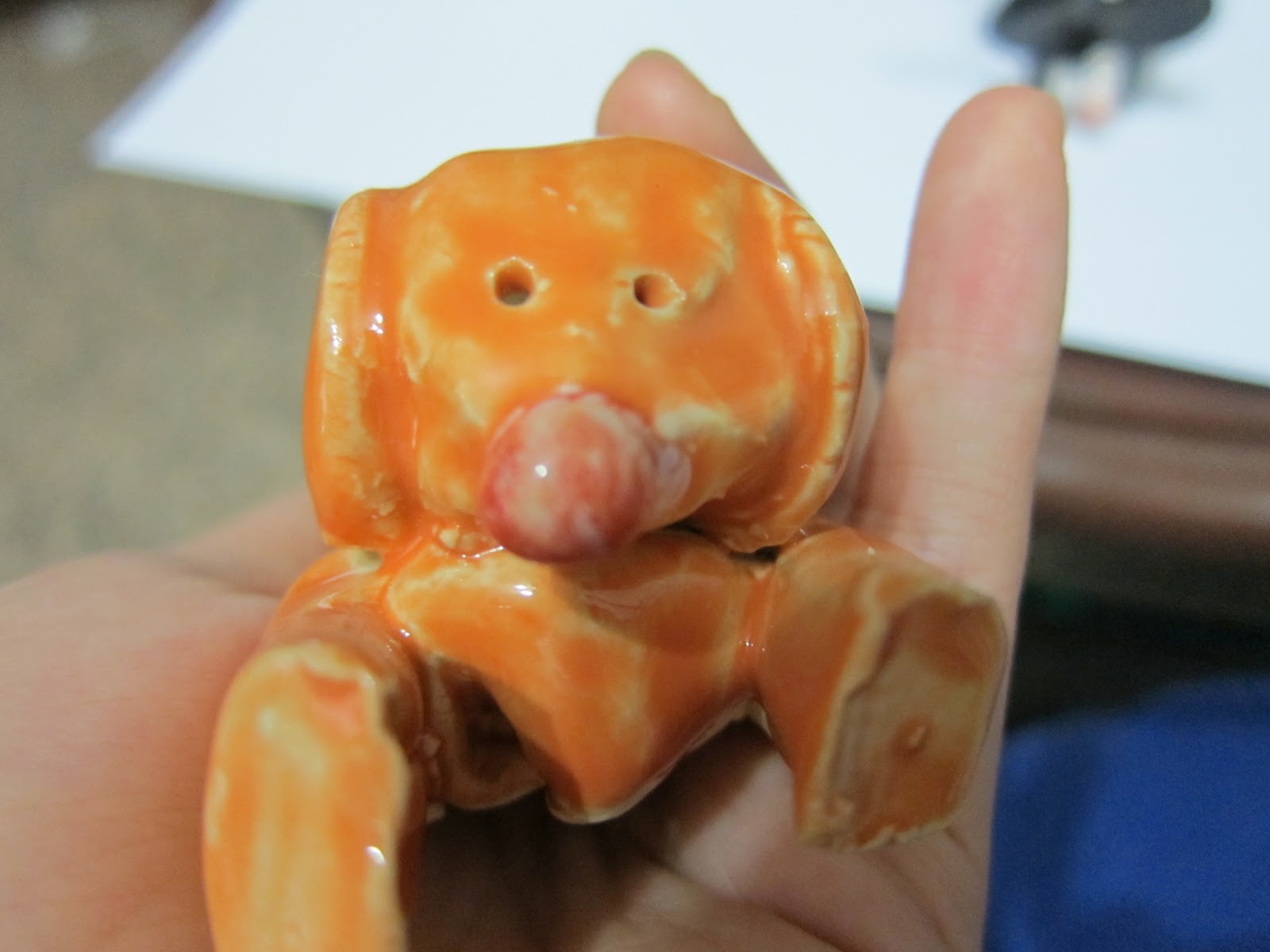
in case you cant tell what these are, its (from left to right) a cat, a dog, and a rat!!


this is the front view of the cat. the paint has run. i remember my first time painting on clay, i piled many layers of paint and i guess it was too thick so the paint ran, or many because the paint is bad, or the clay isn't supposed to be painted on. but everytime i look at this, i think its cute. even though it does not look like a cat, it still represent a younger me. this was how i thought a cat should look like. the cat isnt made nicely, it is not perfect but i still keep it in a casing, together with the dog and the rat

this is the dog! its made of one block of clay, and 4 smaller block and 1 sphere and 2 flat circles and a small ball(nose). i remember that the teacher taught me that in order to stick the two pieces of clay, we had to do some hatching thing. i drew criss crosses on the clay, took some slit, 'applied' it on the criss cross then stick the other piece on clay on it. (had to do hatching on the other piece too!) then i painted it and the colour has run~


this is the rat
HAHA, the colour has run very badly(see bottome pic)
this rat is very cute!

see the blob of paint? haha its so funny^^

all 3 animals are simplified and basic shapes were used to create them. i guess it is because it was done at a young age, so there's not much skill
im glad i've tried clay, i think it is very fun! now that im in nayang, we did a clay module in sec 3 i think..
i did an imaginary animal! a combination of different animals
i think it is still in school, so i'll take a picture of it and post it another time, hopefully, if i can get hold of my prep then i'll post pics of those too!  i wonder if they are with mrs tan or has she returned it to us already~

medium: clay and paint
info: 3D sculpture, dog: l:11m, h:4.5cm, w:4cm
                             cat: l:6.5cm, h 7cm, w 5cm
                             rat: l 4.5cm, h 6cm, w 5cm

this is abstract expressionism!!!!
haha jackson pollock!!!!! my version!!!! actually, i only knew that this is abstract expressionism after learning it in sec 2!
this was done when i was 11 years old, that's .... primary 4? yup yup
at that time, i didnt know what i was doing, i was just spraying dripping paint everywhere on the canvas. i remember it was so much fun and i enjoyed myself throughly when doing this painting! there's no meaning behind this work, only fun and enjoyment. maybe it shows my state of mind at that time? the colours i choose may have deeper meanings but i suppose it was picked at random at that time. linking back to nanyang, our class did an abstract expressionism 201aep version, didnt take pic of it but it was about the same, just that it is bigger, on a brown paper placed on the floor and each of us took turns to drip paint over it. there was red white and purple. we were part of the work, moving around flinging out hands here and there pouring lumps of paint onto the paper. the process was fun. i think abstract expressionism is all about the process and interacting with the art itself. the meaning behind it is second place, not as important as the process(to me, my OWN thoughts) because my seeing the paint drops, it shows a state of mind, be it slow drops or rapid flinging of the brush to create thin and small drops of paint. well that's just my opinion, it differs from one another. this painting is now hanging on the wall in my house!

medium: arcylic paint on plastic like canvas(im not sure what its called, but its not the cloth canvas)
info: 2D painting, 21.5 inch x 28.5 inch

this painting was done when i was in primary school too! its chinese calligraphy! im good at drawing (chinese calligraphy) though my writing is horrible. this is a pair of fish, i have no idea what kind of fish isit. i forgot to write how old i was when i did this painting. its a fairly simple piece of painting. its also framed and is hanging on my wall in my house!
i have a few more calligraphy paintings done when i was younger (now i dont do calligraphy but i hope to take up calligraphy(painting) in my free time, if i even have the time) but then i have to search and dig for it. it is somewhere in my house haha. i think most of my artwork that i did when i was young, i still have it ^^ when i'm free, i'll go dig it up, take photos of it and post pictures of my primary school works!
its interesting when you look back at the works you do when you were younger. the way you see things is different from how to see things now

medium: chinese ink on rice paper
info: 2D painting,  slightly bigger than a4 size

more old paintings will be posted in the future!
tata!
sy