Friday, February 11, 2011

mysterious animals

this is a brief sketch of my final ceramic model. it is a combination of different element found on different animals. it does not have a specific name for it. its curently nameless and i think its still in school?

parrot and toucan
i like how i drew these birds. the strokes were expressive and free, its like im not afraid of drawing something wrong. the different tones also show how fluffy the parrot is, and also shows the turf of feathers on the toucan's chest! i remember drawing all these sketches quickly, i did not really focus on detail but more on the overall effect of the animals. i particularly like this piece of drawing among all the animal drawings

lion and elephant

cheetah and kangaroo. (i know the kangaroo's face looks screwed up. like it got punched or something-__-)

rhino. i remember i couldnt get the proportion right. as you can see, its really sketchy, not contour lines, so you could tell it was done in a short period of time. wrong lines were not erased but rather drawn over again. i remember i had to draw guiding lines for the eyes cause it wasn't in a straight line, more like i couldnt get it in a straight line. now it's still crooked if you look carefully

crane

some sort of antelope? i like the horns, they are soo long and cool haha. it was touch trying to make the face symmetrical. i tried my best~ (i can tell at one glance the ears are not symmetrical haha)

zebra!!! back view!! the zebra's backside is so round!!! it was fun drawing this one because there were many stripes and basically, i just randomly drew the stripes on, did not really refer to a source. this was my first time drawing an animal from the rear view. usually its either the front or the side view, so this was rather interesting. i think i got the proportions quite accurately so it doesnt look weird. 
overall, i am very, extremely, super, satisfied with this piece of work.
i'll update this post again once i've taken the picture of the ceremic work and update some descriptions of it

medium: pencil
info: 2010, sec 3 aep ceremics module

pinhole

2 failed pieces of pinhole photography, under and over exposed

a nice picture taken at the eco pond. i like how everything is still in this photo and that the pond's surface reflects the image of the building plus the trees.

this is a picture taken at the cross section at the heritage corner and general office. the black thing in the centre is the field. kinda get the picture?

this is a picture of nanyang, taken from the canteen, across the quadrangle. it was raining on that day so the floors reflect the building's architecture. its a very pretty photo. cause its negative and positive, it looks as if its a scene of nanyang in the dark night. its silent and still, yet magnificent~
medium: pinhole camera using a tin and photography paper (ilford brand if im not wrong)
info: 2009, sec 2 aep

Sunday, February 6, 2011

title-less

medium: arcylic on canvas, 2011
info: slightly smaller than a4

african elephant
medium: pen on paper
info: a4 sized, 5 min sketch, 2011

im thinking of changing my idea for coursework and back to working with animals
how"?

Wednesday, February 2, 2011

wall paint

during the holidays last year, elizabeth, liyi and i went over to lizzy's aunt's nephew's(lets name him A) tuition centre( sry if its wrong) to paint walls!!
so we met up with A and discussed what kind of theme he wants etc then we took measurements of the wall and sketched it down

themes that they are considering, then ticking the final few

image of a signboard that we'll be painting on

this is the rough sketch (first sketch) in the end, the design was modified

one of the 'inspirational quotes' on the wall

another inspirational quotes on the wall


so the walls have 3 owls (flying: inspiration from eoy painting!) one owl on each panel. simple bold outlines. the owl flies out of the cage and is flying higher and higher. just like how the student's results would go higher and higher!~ haha then owl represents wisdom, so its kinda fitting for the tuition centre. the signboard has different planet names cause the tuition centre is called comets! eh, the windows show different perspectives, one day scene, one night scene. i suppose the dandelions help the students relax abit? haha cause the colour scheme is kinda light. and the night scene is to...... eh, think out of the box perhaps? haha the main thing is just different perspectives.
it was a fun process, spent around 1 week or slightly more slightly less doing this (counting the days we paint and plan and draw, excluding breaks inbetween) my first time painting on a wall!! the more vibrant yellow paint is more watery, its oil based paint, so when painting, it may drip down :/ so that was one thing we had to look out for, overall, i enjoyed this project and hope to do such works in the future

Tuesday, February 1, 2011

rewind (3)

medium: (im not sure what isit) its a cardboard with black paper on it
info: a4 sized, 2008
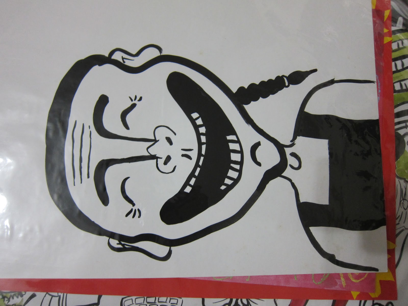
medium: chinese ink
info: 2006
i've never really done any chinese paintings already but i remember last time i used to enjoy drawing birds~ i have no idea where they went

medium: marker and watercolour
info: a4 sized, kindergarten (suuuuuuper old!)

medium: marker
info: a4 sized, kindergarten 
portraits of my father and mother!!!!!
HAHAHAHAHHAHA
medium: paint
info: half an a4 paper, lower primary

medium: paint
info: a3 sized, 2006
medium: paint
info: a3 sized, 2006
the words read "she is called marim. she scored full marks for her exam. if she gets 100 marks, she will have u buy her.." i give up reading cause i cant read my handwriting..

medium: paint
info: a3 sized, 2006
if you look closely enough, the words around the girl read " this is aqua. she just got a date. she is happy that she has found a man who did not see her apple and thinks she is a beautiful girl"
i wonder what i was thinking when i painting this oO oh, these series of painting was done directly using paint, so its more of a impromptu kind of work, which makes it more interesting! esp the accompanying words!! she's a guy!!! see the APPLE!!


the above two artwork were inspired by Yue Min Jun. His trademark is painting a laughing face, no matter what the subject matters are doing. the faces are the same, its like a stereotyped. i was intrigued by his art when introduced by a nafa teacher. though my painting is not the same, the similarities are that the subject matter is always smiling, ALSO! I'VE ADDED THE PIG NOSE!!!! haha, it was fun painting these series
artwork: The Massacre at Chios by Yue Min Jun
i think his paintings are freaky and i wouldn't buy them because I've no where to hang it in my house. its so creepy!!! the faces on the characters are exactly if not 98% similar. its like cloning, photocopying a person. moreover, he is always laughing and his mouth is ridiculously big and there SO MANY TEETH and the inside of the mouth is black. i mean. its weird. but this is what makes him famous. it's hi's distinctive art style. once you see this face, you would know its him. AND I JUST REALISED, HIS WORK IS ACTUALLY HIS INTERPERTATION OF Delacroix, Eugène 's WORK. HERES THE ORIGINAL AND HIS WORK AGAIN
 The Massacre at Chios
Delacroix, Eugène, in full FERDINAND- VICTOR-EUGENE DELACROIX (b. April 26, 1798, Charenton-Saint-Maurice, Fr.--d. Aug. 13, 1863, Paris), the greatest French Romantic painter, whose use of colour was influential in the development of both Impressionist and Postimpressionist painters. His inspiration came chiefly from historical or contemporary events or literature, and a visit to Morocco in 1832 provided him with further exotic subjects. Eugene Delacroix is numbered among the greatest and most influential of French painters. He is most often classified as an artist of the Romantic school. His remarkable use of color was later to influence impressionist painters and even modern artists such as Pablo Picasso.Ferdinand-Victor-Eugene Delacroix was born on April 26, 1798, in Charenton-St-Maurice, France. In 1815 he became the pupil of the French painter Pierre-Narcisse Guerin and began a career that would produce more than 850 paintings and great numbers of drawings, murals, and other works. In 1822 Delacroix submitted his first picture to the important Paris Salon exhibition: Dante and Virgil in Hell. A technique used in this work--many unblended colors forming what at a distance looks like a unified whole--would later be used by the impressionists. His next Salon entry was in 1824: Massacre at Chios. With great vividness of color and strong emotion it pictured an incident in which 20,000 Greeks were killed by Turks on the island of Chios. The French government purchased it for 6,000 francs.
there's a sense of irony in his works. this painting was suppose to capture the strong emotion in which 20,000 greeks were killed. but the sky is blue, the men are smiling, cranes are flying. whats so emotional about this painting? its all happy and gay. see the similarities and the differences? next time i will do a post on him, he's so interesting!!!!! i need to sleep now. tata

pointilism


well theres nothing much to explain right? title says it all!

my first attempt at pointilism. it killed me halfway but the result was satisfying. i should have recorded the process :/ then it would be interesting! picture was drawn lightly with a 2b pencil, then the dotting starts. the different thickness of the marker and the compactness of the dots are the key to shading this piece, its fun yet challenging, i enjoyed this work throughly
medium: black markers of different thickness
info: a3 sized paper, 2009